
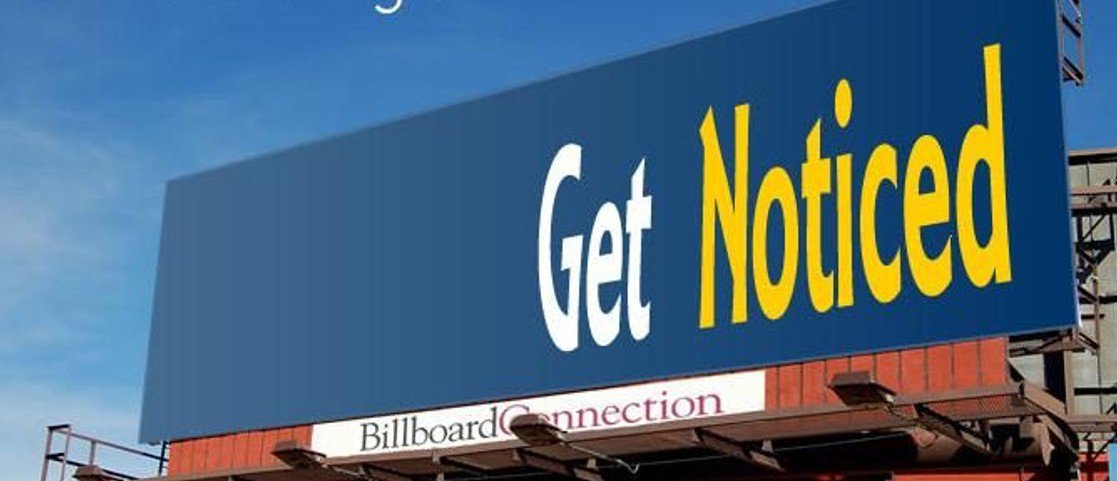
Billboard font visibility matters most when drivers have almost no time to read. On a highway, a message has to work in seconds. People are watching traffic, checking exits, and moving at high speed. If the text is hard to read, the ad may be seen without the message being understood.
That is what makes font choice so important in outdoor advertising. For medium and large-sized companies, a billboard should do more than look good in a design file. It should be readable in real conditions. Font size, spacing, weight, and contrast all affect whether the message is clear enough to register at 70 miles per hour.
Why Billboard Font Visibility Matters at Highway Speed
A billboard on a fast road does not have much time to communicate. Drivers are not reading carefully. They are scanning quickly while staying focused on the road. That changes what good design looks like.
At highway speed, even small text problems become bigger. Letters that are too thin can disappear. Tight spacing can make words harder to separate. Weak contrast can reduce clarity, especially when the background competes with the text. A message that looks clean on a screen can become much harder to read from a moving vehicle.
This is where billboard font visibility becomes a practical issue, not just a creative one. The text has to be built for distance, speed, and limited attention. If it is not, the ad may lose impact before the audience has time to process the message.
Good Font Visibility Helps Drivers Read Faster
Drivers do not read billboards word by word. They scan quickly and absorb what they can in a moment. That means the font needs to help the eye move through the message without effort.
A readable font makes that easier. Clean letterforms, simple shapes, proper spacing, and strong contrast all help drivers recognize the message faster. On the other hand, decorative fonts, narrow lettering, or crowded text can slow reading down. At highway speed, that small delay can be enough for the message to lose impact.
This is why billboard font visibility is closely tied to read time. A driver may only have a few seconds of clear view. During that time, the ad has to communicate the brand and the main point without asking too much from the audience.
In practical terms, the easier the text is to read, the more value the advertiser gets from the location.
A Short Message Still Needs the Right Font
Many advertisers know that billboard copy should be short. That is true, but short copy alone does not solve the problem.
A five-word message can still be hard to read if the font choice works against it. Thin letters may disappear against the background. Tight spacing may make words run together. Low contrast may reduce clarity, especially in bright sun, fading daylight, or fast-moving traffic.
That is why the message and the font need to work together. A strong headline becomes much more effective when the type is built for distance and speed. In outdoor advertising, clear writing and clear design depend on each other.
Billboard Font Visibility Supports Better Recall
A billboard does not have much time to make an impression. If the text is easy to read, the audience has a better chance of remembering the brand later.
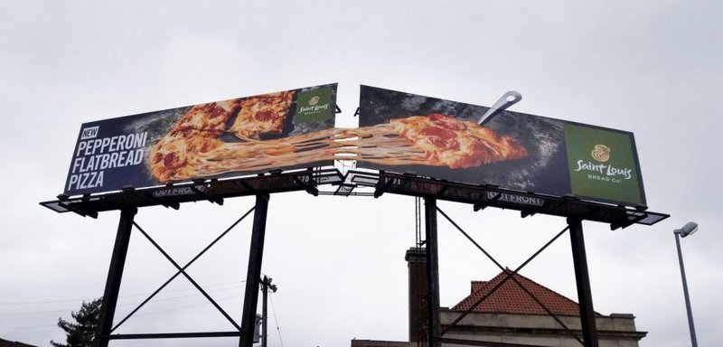
This matters because many people do not act right away. They may notice the ad during a commute, remember the company name later, and search for it when the need becomes more immediate. That only works if they were able to read the message clearly in the first place.
So while font visibility may seem like a design detail, it affects something much larger. It helps determine whether the brand becomes recognizable or fades into the background. For companies that want stronger awareness and market presence, that can make a real difference.
Strong Design Protects the Value of the Placement
A company may invest heavily in a good location. It may choose a busy corridor, a strong route, or a premium market. However, if the text is hard to read, part of that investment is wasted.
That is why billboard font visibility should be part of planning, not something checked at the end. The font needs to match the road, the speed of traffic, and the real conditions in which the ad will be viewed. A design that looks sharp on a screen may not perform the same way on the road.
When the font is clear, the message has a better chance of being seen, understood, and remembered. That helps protect the value of the creative, the placement, and the campaign as a whole.
Better Visibility Starts With Better Planning
A common challenge in outdoor advertising is limited access to available locations. When a company cannot review all its options, it becomes harder to match the creative to the right viewing conditions.
Billboard Connection Atlanta helps solve that problem with local expertise and access to every billboard in every market in the U.S. That gives medium and large-sized companies a better way to evaluate placements based on visibility, traffic flow, and campaign goals.
If your team wants billboard advertising that is easier to read and built for real-world viewing, reach out to us to explore billboard opportunities in Atlanta and beyond.