

Most billboard ads get between three and five seconds of attention. That is not enough time to tell a story, list features, or explain a value proposition. There is only enough time to make one thing land. The brands that understand that constraint are the ones that design billboard ads people actually remember.
This is not about creative talent alone. It is about applying the right principles to a format with very specific rules.
Why Billboard Ads Demand a Different Creative Approach
A billboard is not a website, a print ad, or a social post scaled up to a larger size. Each of those formats allows the audience to slow down, scroll back, or read at their own pace. A billboard does not. The audience is moving, usually at speed, with their attention divided between the road and everything else in their field of view.
That means every creative decision, headline length, font size, color contrast, and image choice has to serve one goal: make the message land in the time it takes to pass the display. A design that works beautifully on a screen may completely fail at road speed. Understanding how high-traffic billboard placement affects viewing conditions is the first step toward designing creative that actually performs.
The One Message Rule
The single most common mistake in billboard creative is trying to say too much. A headline, a subheadline, a phone number, a website, a tagline, and a logo are not a billboard ad. It is a cluttered surface that drivers will ignore because nothing stands out enough to register.
Effective billboard ads carry one message. That message can be a brand name, a single benefit, a location, or a call to action, but not all of them at once. The supporting elements like the logo, the URL, or the phone number should reinforce that message without competing with it.
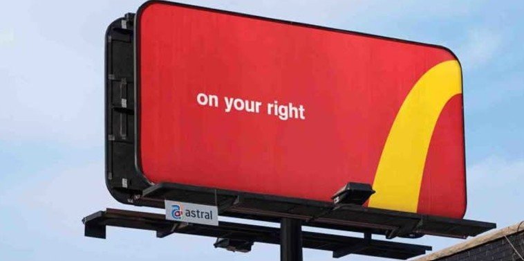
If you cannot state your billboard message in five words or fewer, the concept needs more editing. Brevity is not a limitation of the format. It is the entire discipline.
How Contrast and Color Make Billboard Ads Readable at Speed
Color does more work on a billboard than on almost any other format. It is what catches the eye before the headline has a chance to. High contrast between the background and the text is not optional. It is the baseline requirement for a readable display.
Dark text on a light background and light text on a dark background both work well when the contrast ratio is strong. What fails is low-contrast combinations like gray on white, navy on black, or any palette where the text and background compete in the same tonal range. Those combinations look refined in a design mockup and disappear at 60 miles per hour.
Font choice matters just as much. Condensed, decorative, or script fonts may carry brand personality in other contexts, but they sacrifice legibility on a billboard. Clean, bold, sans-serif typefaces hold up at distance and at speed in a way that ornate fonts simply do not.
How Images and Simplicity Work Together
A strong billboard image does one of two things: it reinforces the message or it creates enough visual interest to pull the eye toward the headline. What it should not do is add complexity, require interpretation, or compete with the text for attention.
The most effective billboard visuals are simple, high-contrast, and directly connected to the message. A single face, a single product, a bold graphic. These work because they give the eye one place to land. Busy backgrounds, multiple subjects, and detailed scenes all reduce the speed at which the message registers.
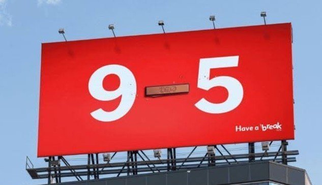
White space is not wasted space on a billboard. It is what gives the headline room to breathe and makes the message easier to read from a distance. Some of the most recalled billboard ads in any market use more empty space than most designers are comfortable with, and they work precisely because of it.
What a Strong Call to Action Looks Like
A call to action on a billboard needs to be as simple as the rest of the message. A phone number, a short URL, or a single-word instruction like "Call," "Visit," or "Book" is enough. Anything longer creates a second reading task that most drivers will not complete.
The call to action should also match the audience's likely next step. A brand building awareness in a new market does not need a phone number. It needs the name to stick. A business running a location-specific promotion does need a URL or address that the audience can recall after they have passed the display.
Mobile billboard advertising follows the same creative rules but adds the variable of proximity. When the display moves through a neighborhood, the call to action can be more specific because the audience is closer to the point of action.
How Placement and Creative Work Together
Even the best-designed billboard ad will underperform in the wrong location. Creative and placement are not separate decisions. They inform each other, and the strongest campaigns treat them that way from the start.
A display on a fast-moving highway needs a shorter headline and larger type than a display on a slower surface street. A billboard near a retail corridor can carry more specific offer language than one on a commuter route where the audience is not in purchase mode. The local Atlanta billboard agency that knows those conditions can help you match creative decisions to placement realities before production begins.
Reach out to Billboard Connection to build billboard ads that are designed to perform in the specific locations where your audience will see them.